

Bold Wall Color Trends in Hyderabad: Ideas for a Home That Feels Personal
Bold Wall Color Trends in Hyderabad 2025
Transform Your Home with Vibrant Hues
Bold wall colours can bring depth, character and personality to a home without making every room feel busy. The most practical approach is to choose one or two areas for stronger colour, then balance them with the room’s natural light, furniture, flooring and finishes. In Hyderabad homes, the right shade should work in both daylight and artificial lighting—and still feel comfortable to live with after the initial excitement wears off.
What Are the Best Bold Wall Colours for Hyderabad Homes?
Some of the most versatile choices are deep teal, olive green, terracotta, muted burgundy, navy blue and charcoal. Each creates a different mood. Teal and navy can add depth, olive green feels grounded, terracotta brings warmth, and charcoal creates a strong contemporary backdrop.
The colour alone does not determine the result. The size of the wall, direction of natural light, nearby furniture and finish of the paint all affect how the shade looks. Before committing to a bold colour, test a sample in the actual room and view it at different times of day.
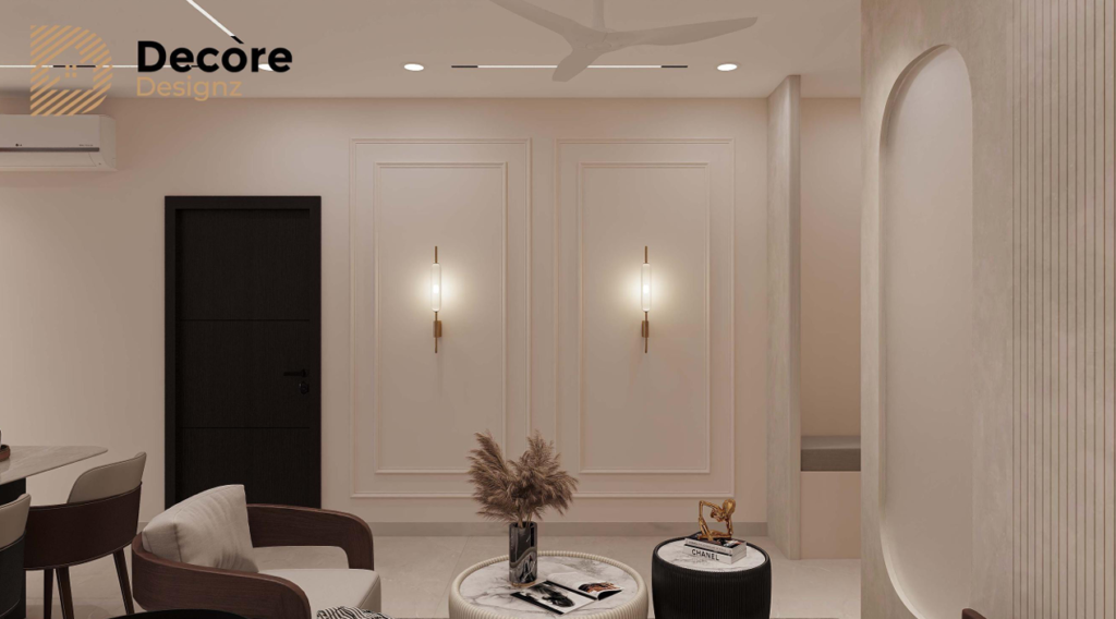
1. Deep Teal for a Contemporary Living Room
Deep teal works well when you want a room to feel distinctive without relying on several decorative elements. It can sit comfortably alongside warm wood, off-white upholstery, beige flooring and restrained metal accents.
Where it works: A living-room feature wall, a wall behind a sofa, or a carefully selected dining-area wall.
How to balance it: Keep the surrounding walls lighter and let the furniture provide contrast. Warm lighting can soften the colour in the evening, while natural daylight may make its blue or green undertones more noticeable.
When to avoid it: If the room receives little daylight and already has dark flooring, heavy furniture and limited visual contrast, deep teal across several walls may make the space feel enclosed. Test it on one wall first.
2. Olive Green for a Calm, Natural Look
Olive green is a useful alternative to conventional beige or grey when you want more character without a very bright colour. It works particularly well with wood tones, cream fabrics, natural textures and simple furniture.
Where it works: Bedrooms, reading corners, living rooms and spaces with timber furniture.
How to balance it: Pair olive with warm white, sand or muted beige. Natural-looking wood finishes can help the palette feel connected rather than overly coordinated.
Olive is not automatically a calming choice in every room. A yellow-heavy olive can look quite different from a darker, grey-toned version. Check the undertone against your flooring and furniture before selecting the final shade.
3. Terracotta for Warmth and Character
Terracotta brings the warmth of clay and earth into an interior. It can add colour without the sharp contrast associated with brighter reds or oranges.
Where it works: A dining-area wall, an entry feature, a niche or a living-room wall with relatively simple furniture.
How to balance it: Combine it with ivory, warm white, beige or natural wood. Textured fabrics and restrained décor can complement the colour without making the room look crowded.
What to watch: Terracotta shades can become more orange or intense under warm artificial lighting. Check the sample in the evening as well as during the day, especially if the room relies heavily on ceiling lights.
4. Navy Blue for a Refined Statement
Navy blue offers a stronger, more formal look. It can work in contemporary interiors where the furniture, lighting and other finishes are kept relatively simple.
Where it works: A bedroom feature wall, a study backdrop or a living room with enough visual contrast.
How to balance it: Use lighter bedding, upholstery or wall colours nearby. Wood, brushed metal and selected light-coloured accessories can prevent the darker wall from becoming the only thing you notice.
Navy is best treated as a considered design choice, not a shortcut to a luxurious-looking room. If the room is compact, look at the wall’s size and the amount of daylight before deciding how much of the space to paint.
5. Charcoal Grey for a Modern Interior
Charcoal creates a strong background for artwork, selected furniture and warm lighting. It can be effective when the rest of the room has a clear palette rather than several competing colours.
Where it works: A feature wall behind a television unit, a study area or a room with lighter flooring and furniture.
How to balance it: Introduce contrast through off-white, warm wood, textured upholstery or a lighter ceiling. The aim is to give the eye places to rest instead of making every surface dark.
When to reconsider it: In a poorly lit room with dark flooring and large dark furniture, charcoal may reduce the sense of openness. A softer grey or a smaller painted section may be a better solution.
6. Muted Burgundy for a Richer, More Personal Space
Muted burgundy can give a bedroom or selected sitting area a richer character. It is more visually demanding than a neutral shade, so the surrounding palette matters.
Where it works: A bedroom accent wall, a small reading area or a wall intended to provide a strong backdrop for simple furnishings.
How to balance it: Keep nearby finishes quiet. Cream, warm white, muted beige and selected wood tones can prevent the colour from competing with the furniture.
Choose a sample carefully. Some burgundy shades lean towards purple, while others appear brown or red under different lighting. The undertone should suit the rest of the room.
7. How to Choose a Bold Wall Colour for Your Home
A colour that looks excellent in a photograph may not work as well in your home. Before choosing paint, consider these five things.
Start with the room’s natural light
Observe the wall in the morning, afternoon and evening. A colour may look brighter in direct sunlight and deeper in a shaded corner. Artificial lighting changes it again.
Match the colour to fixed finishes
Flooring, doors, window frames, countertops and large furniture are harder to change than paint. Compare your sample with these elements rather than choosing the wall colour in isolation.
Decide what the wall needs to do
A bold wall can draw attention to a seating area, frame a bed or give a plain dining area a clearer identity. If the room already has a strong focal point, another statement wall may not be necessary.
Consider the finish, not just the shade
Paint finishes can change how a colour appears and how easily the wall can be maintained. The right option depends on the wall condition, lighting, expected use and manufacturer’s guidance. Test the proposed finish alongside the colour sample.
Test before painting the entire wall
Use a sample on the actual surface where possible. Check it in daylight and under the lights you normally use. A small sample card viewed in a shop cannot fully show how a colour will behave across a large wall.
8. Should You Paint One Wall or the Entire Room?
For many homes, a single feature wall is the more controlled way to introduce a strong colour. It creates a focal point while allowing the rest of the room to remain visually quieter.
Painting multiple walls can also work, particularly when the room has good natural light and a deliberately planned palette. The decision should depend on the room’s proportions, furnishings and intended mood—not on a rule that bold colours must always be limited to one wall.
Before painting, look at the whole room from the entrance. Consider the sofa, bed, curtains, artwork, flooring and lighting together. If several elements already demand attention, a simpler wall treatment may create a more balanced result.
9. A Practical Note from Decore Designz Studio
Colour decisions are more reliable when they are made alongside furniture, flooring and lighting decisions. A wall shade should not be selected first and then forced to work with every other element.
For example, Decore Designz Studio’s Kokapet residential project uses a walnut, grey and beige palette across an approximately 1,800 sq. ft. home. That documented palette illustrates why colours and finishes need to be considered together. It does not mean every home should use neutrals—or that the project used the bold shades discussed in this guide.
If you are exploring a stronger wall colour, start with the room’s existing finishes and decide what the colour should contribute. You can also browse our interior design projects in Hyderabad to see how design choices fit into complete homes, rather than viewing a wall colour in isolation.
10. Common Mistakes to Avoid with Bold Wall Colours
- Choosing a shade from a photograph alone: Screens and photographs do not reliably reproduce the colour you will see on your wall.
- Ignoring undertones: A colour can appear too yellow, blue, red or grey when placed next to the wrong flooring or furniture.
- Using too many statement elements: Bold paint, patterned wallpaper, striking furniture and decorative lighting can compete for attention.
- Forgetting evening lighting: A colour that feels balanced during the day may look much darker or warmer at night.
- Following a trend without considering daily life: Choose a colour you can comfortably live with, not just one that looks current.
- Painting before the wider palette is settled: Confirm the main furniture and finish choices before finalising the wall colour.
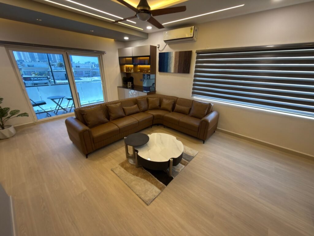
Planning the Colours for Your Home?
A good colour scheme should look considered, but it should also work with the way you use your home. Decore Designz Studio plans residential interiors around space, furniture, lighting, materials and everyday requirements—not colour trends alone.
If you are planning a new apartment, villa or home renovation, explore our interior design services in Hyderabad to understand how design decisions can be coordinated from planning through execution. You can also contact Decore Designz Studio to discuss your requirements.
Frequently Asked Questions
Which bold wall colour is best for a small living room?
There is no single best colour for every small living room. Deep teal, olive, terracotta or muted blue can work when balanced with suitable lighting and lighter surrounding finishes. Test the colour in the actual room before deciding.
Are dark accent walls suitable for Hyderabad apartments?
Yes. Dark accent walls can work in apartments, but the amount of daylight, room proportions, flooring and furniture should guide the choice. A single darker wall may be easier to balance than several dark walls in a compact room.
Which wall colour goes well with wooden furniture?
Olive green, deep teal, terracotta, warm white and selected muted greys can complement wood. The best choice depends on whether the wood has warm, reddish, yellow or cooler undertones. Compare paint samples with the actual furniture.
Should the feature wall be behind the sofa or the television?
Choose the wall that gives the room a clear focal point without competing with windows, artwork or other prominent features. In some living rooms, the sofa wall works better; in others, the television unit already provides enough visual interest.
How can I tell whether a bold paint colour will look different at night?
Test a sample on the intended wall and view it under the room’s normal artificial lighting. Warm and cool light sources can change the way a shade appears. Make the final decision only after checking it in both daylight and evening conditions.
Can bold wall colours work with a minimalist interior?
Yes. Minimalism does not require every wall to be white or beige. A carefully chosen statement colour can give a simple room character while the furniture, storage and decorative elements remain restrained.