

Colours by Facing Direction: North, South, East and West-Facing Rooms
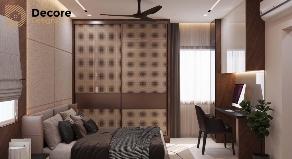
The best wall colour for a north-facing room is often a warm white, soft beige or muted greige, while south-facing rooms can generally accommodate a wider range of colours. East-facing rooms benefit from shades that work with morning light, and west-facing rooms need colours that remain comfortable under warmer afternoon sunlight. The right choice depends on window size, external obstructions, flooring, artificial lighting and the finish of the paint—not direction alone.
Why does the direction of a room matter when choosing wall colours?
Natural light changes how paint looks. A shade that appears warm and inviting in the morning can look noticeably different in the afternoon. The same colour may also appear lighter or darker depending on the amount of daylight entering the room.
In Hyderabad, where many homes have large windows, balconies, neighbouring buildings and varying degrees of direct sunlight, the room’s actual lighting conditions matter more than a rule that assigns one colour to every direction.
Before choosing paint, consider three things:
- Light intensity: How bright does the room become during the day?
- Light quality: Does the room receive cooler, indirect daylight or warmer, direct sunlight?
- Existing finishes: Do the floor, furniture, curtains and ceiling make the space feel warmer or cooler?
Use these factors to narrow your palette. Then test the shortlisted shades on the actual wall.
1. What are the best wall colours for a north-facing room?
North-facing rooms in the Northern Hemisphere often receive softer, more indirect daylight than rooms exposed to direct southern or western sun. However, window placement, nearby buildings and the season can change this significantly.
For a room that feels dim or cool, start with warm, light-reflecting colours.
Colours worth considering:
- Warm white: Keeps the room bright without the stark appearance some pure whites create.
- Soft ivory: Adds a gentle warmth to bedrooms and living rooms.
- Light beige: Creates a comfortable backdrop for wooden furniture and neutral upholstery.
- Warm greige: Balances grey and beige without making the room feel too cold.
- Pale sage: Introduces a subtle green tone while keeping the palette restrained.
What should you avoid?
Do not automatically cover a dim room in dark charcoal, deep navy or cool grey. These colours can make a room feel heavier when daylight is limited. They can still work as accent colours or in a carefully lit space, but test them before committing to all four walls.
For a north-facing bedroom, warm white with natural wood finishes is a practical starting point. In a living room, light greige can provide a little more depth without making the walls feel visually heavy.
2. Which paint colours work best in a south-facing room?
South-facing rooms in Hyderabad can receive substantial daylight, depending on the window orientation, shading and season. A brighter room gives you more flexibility with colour, including shades that might feel too dark in a poorly lit space.
Colours worth considering:
- Soft white: Maintains an open, clean appearance.
- Muted sage green: Adds colour without overwhelming a bright room.
- Dusty blue: Creates a calmer contrast with warm flooring and wood.
- Sand or stone beige: Works well with natural textures and neutral furniture.
- Muted terracotta: Adds warmth and character, particularly as an accent.
What should you watch for?
A bright room can make some colours appear more intense than expected. Highly saturated yellow, orange or red may feel overpowering across large wall surfaces, especially when combined with warm artificial lighting.
If the room already receives strong sunlight, consider a restrained wall colour and introduce stronger tones through artwork, cushions or a feature wall.
For a contemporary living room, muted sage or stone beige can balance daylight with the warmth of timber, textured fabrics and neutral furniture.
3. What are the best colours for an east-facing room?
East-facing rooms typically receive their strongest direct sunlight in the morning, with the light changing as the day progresses. This makes them useful spaces for colours that look fresh in daylight without becoming too cold when the direct sun moves away.
Colours worth considering:
- Warm white: Keeps the room feeling fresh early in the day.
- Pale beige: Adds softness without competing with morning light.
- Light sage: Creates a subtle connection with natural materials.
- Powder blue: Gives bedrooms and study areas a quieter colour scheme.
- Blush beige: Introduces a gentle warm undertone without becoming strongly pink.
What should you watch for?
A colour that looks beautiful in bright morning sunlight may look flatter later in the afternoon. Check the shade at different times before deciding.
For an east-facing bedroom, warm white or pale sage can create a restrained, restful backdrop. In a breakfast area or compact dining space, light beige can work with timber and neutral furnishings.
4. Which colours are best for a west-facing room?
West-facing rooms often receive stronger, warmer afternoon sunlight. Depending on the windows and surrounding buildings, this can make warm paint colours appear more intense and increase glare.
The objective is not necessarily to choose cool colours. It is to avoid adding more visual warmth than the room needs.
Colours worth considering:
- Soft white: Provides a clean background when afternoon light becomes intense.
- Light greige: Balances warm sunlight with a more neutral undertone.
- Muted blue-grey: Adds a cooler counterpoint to warm afternoon light.
- Pale sage: Offers colour without excessive saturation.
- Soft stone: Creates a neutral base for warm wood, metal and fabric finishes.
What should you watch for?
Strong yellows, oranges and warm reds may become more intense under direct afternoon sunlight. That does not make them unsuitable, but the effect should be tested on the wall before painting the entire room.
For a west-facing living room, light greige or soft stone is a useful starting point. If the room has large windows, combine the palette with suitable curtains or blinds to manage glare rather than expecting paint alone to solve the problem.
How should you choose colours for different room directions?
Use this table as a starting point, not a rigid rule.
Room direction | First colours to sample | Main consideration |
North-facing | Warm white, ivory, light beige, warm greige | Avoid making a dim room feel colder or heavier. |
South-facing | Soft white, sage, dusty blue, stone beige | Manage colour intensity in strong daylight. |
East-facing | Warm white, pale beige, light sage, powder blue | Check how the colour looks after morning sunlight fades. |
West-facing | Soft white, light greige, muted blue-grey, pale sage | Consider warm afternoon light and glare. |
These are starting palettes, not guarantees. A north-facing room with a large unobstructed window may be brighter than a west-facing room shaded by another building.
How can you test wall paint before choosing the final colour?
Paint samples are more reliable than choosing a shade from a small printed card or a digital screen.
Follow this process:
- Shortlist two or three shades. Compare their undertones rather than selecting colours that look almost identical on a sample card.
- Test on the actual wall. Use sample patches large enough to see the colour clearly in the room.
- Observe the colour at different times. Check morning, midday and afternoon light where possible.
- Compare it with fixed finishes. Look at the flooring, wardrobe laminate, countertop, upholstery and ceiling together.
- Check artificial lighting. Warm and cool light sources can make the same paint appear different at night.
- Confirm the paint finish. Matte and higher-sheen finishes can reflect light differently and affect how surface imperfections appear.
Do not finalise paint before considering the main furniture and flooring finishes. A wall colour that looks right on its own may clash with the undertone of the floor or make a wood finish appear unusually orange or grey.
Should Vastu determine wall colours by direction?
Vastu-based colour recommendations are a cultural design preference for some homeowners. They can be considered when they matter to the household, but they should not replace practical assessment of daylight, room function, material finishes and personal comfort.
There is no single colour that is objectively best for every north-, south-, east- or west-facing room. If you want to follow Vastu, identify those preferences early and shortlist shades that also work under the room’s actual lighting conditions.
This approach helps avoid choosing a colour solely because it is associated with a direction, only to find that it looks too dark, too saturated or unsuitable alongside the rest of the interiors.
What should you remember before finalising the palette?
Room orientation is a useful starting point, but it is not a complete colour-selection method. Window size, shading, surrounding buildings, wall finish, flooring and artificial lighting all influence the final result.
[NEEDS REAL DETAIL: Add one verified Decore Designz Studio project with the actual locality, room orientation, selected wall colour or palette, surrounding finishes, and a real design decision. Confirm that the project was executed before describing it as completed.]
For more inspiration, explore our guide to bold wall colour trends in Hyderabad. To understand how colour affects the atmosphere and perception of an interior, read the importance of colours in interior design.
Plan your colours around the home, not just the compass
The strongest interior palettes are chosen in context. The same neutral may look warm in one room and cooler in another, so assess each space before deciding on a whole-home colour scheme.
Decore Designz Studio has been designing residential interiors since 2014, with a focus on practical planning, coordinated finishes and homes designed around how people actually live.
If you are planning a home interior in Hyderabad, speak with our team about premium interior design in Hyderabad and how wall colours, lighting, furniture and materials can work together in your home.
Decore Designz Studio
Interior designer serving Hyderabad and Telangana
Phone: +91 96182 18055
Email: decoredesignzstudio@gmail.com
Frequently asked questions
Which colour is best for a north-facing room?
Warm white, ivory, light beige and warm greige are useful starting points for a north-facing room that receives limited direct sunlight. Test the shade in the actual room before finalising it.
Which colours are suitable for south-facing rooms?
South-facing rooms can often accommodate soft whites, muted greens, dusty blues and deeper accent colours. The right choice depends on the intensity of daylight and the room’s existing finishes.
What is the best colour for an east-facing bedroom?
Warm white, pale beige and light sage are practical options. They can work with morning sunlight while remaining relatively restrained as the light changes during the day.
Which wall colours work well in a west-facing living room?
Light greige, soft white, muted blue-grey and pale sage are worth sampling. Consider how warm afternoon sunlight affects the chosen shade and whether window treatments are needed to manage glare.
Do wall colours look different depending on direction?
Yes. The direction of incoming daylight can affect the appearance of a paint colour, but the result also depends on window size, obstructions, time of day, season, surrounding finishes and artificial lighting.
Should I choose wall colours according to Vastu or lighting?
You can account for both. Treat Vastu as a personal or cultural preference, then verify that the selected colour works with the room’s daylight, function and materials.