

Living Room Colour Combinations: Pairings That Work in Indian Homes
The best living room colour combination balances wall shades, furniture, natural light and the way your family uses the space. In Indian homes, warm white with beige, sage green with cream, grey with wood, and muted yellow with off-white are versatile starting points. The right choice depends on room size, window direction, flooring and existing finishes—not just which colours look attractive in isolation.
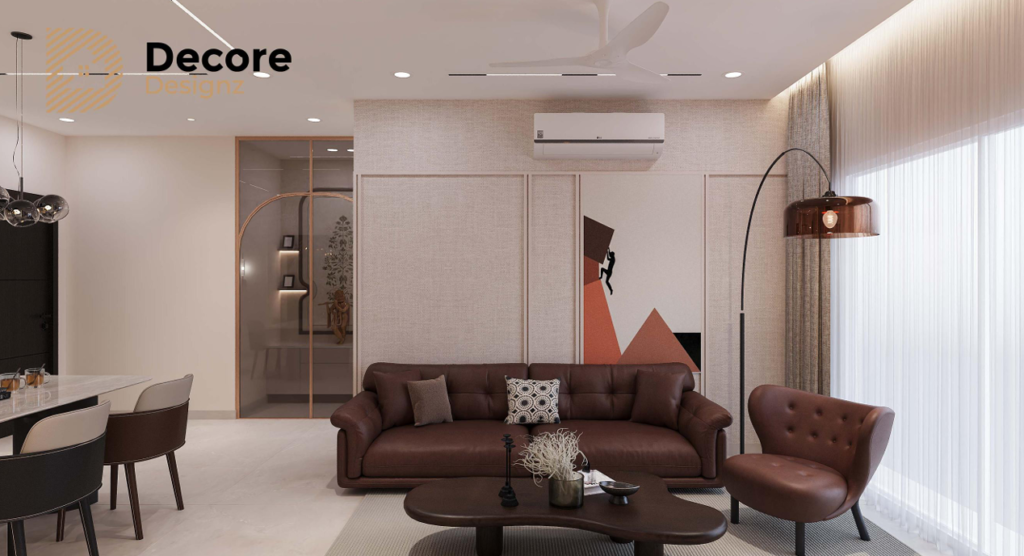
How Do You Choose the Best Living Room Colour Combination?
Start with the elements that are difficult to change. These include flooring, large furniture, window treatments and fixed woodwork. Then choose wall colours that complement them.
For most Indian living rooms, a practical approach is to use one dominant colour, one supporting shade and a smaller accent. This creates visual balance without making the room feel too busy.
Before finalising a palette, consider five things:
- Natural light: A room receiving strong afternoon sunlight may need different shades from one that remains dim throughout the day.
- Room size: Lighter colours can make a compact room feel more open, while deeper shades can add intimacy and definition.
- Flooring: Cream, beige, grey and wood finishes each influence how wall colours appear.
- Furniture: Coordinate the walls with your sofa, curtains, rug and TV unit.
- Daily use: Consider maintenance, children, pets and how frequently the room is used.
For homes in Hyderabad, also observe how the room looks during bright afternoons and under artificial lighting in the evening. A shade that appears soft in a showroom can look considerably warmer or cooler at home.
10 Living Room Colour Combinations That Work in Indian Homes
The following pairings offer different moods, from understated and spacious to rich and expressive. Use them as starting points and adjust the shades to suit your existing interiors.
| Colour Combination | Overall Look | Works Particularly Well For |
|---|---|---|
| Warm White and Beige | Soft and timeless | Compact apartments and neutral interiors |
| Cream and Natural Wood | Warm and welcoming | Homes with wooden furniture or flooring |
| Grey and White | Clean and contemporary | Modern apartments and minimalist spaces |
| Sage Green and Cream | Calm and natural | Relaxed living spaces |
| Olive Green and Beige | Earthy and sophisticated | Rooms with wood and textured fabrics |
| Muted Yellow and Off-White | Cheerful and bright | Rooms that need warmth and character |
| Navy Blue and Warm White | Defined and dramatic | Accent walls and carefully balanced interiors |
| Terracotta and Cream | Warm and characterful | Indian-inspired and earthy interiors |
| Dusty Blue and Beige | Gentle and understated | Relaxed contemporary homes |
| Greige and Charcoal | Restrained and modern | Interiors with darker furniture and metal accents |
The combination matters, but so does the proportion. A dark colour covering one feature wall can feel elegant, while the same colour on every wall may make a smaller room feel enclosed.
1. Warm White and Beige: A Reliable Choice for Most Living Rooms
Warm white and beige create a bright, understated interior without making the room feel stark. The combination works particularly well when you want flexibility in furniture, curtains and decorative accessories.
How to use it:
- Use warm white on the main walls.
- Introduce beige through an accent wall, sofa upholstery or curtains.
- Add wooden furniture to bring depth and texture.
- Use black or bronze accents sparingly for contrast.
This living room wall colour combination is especially useful when the room receives limited natural light. However, avoid choosing a white with a strong yellow undertone if the flooring and furniture already have warm colours.
Designer’s tip: Compare the paint sample with the actual flooring and upholstery before deciding. Several shades of white can look nearly identical on a colour card but noticeably different when applied across a wall.
2. Cream and Natural Wood: Warmth Without Visual Clutter
Cream and wood finishes are a practical pairing for Indian homes because they create warmth without relying on strong colours.
Cream walls work well with walnut, teak-inspired finishes and lighter oak tones. The final appearance depends on the wood’s undertone and the amount of visible grain.
For a balanced result, use cream on the walls and introduce wood through the TV unit, shelving, centre table or furniture detailing. If the room already contains extensive woodwork, keep additional wooden elements restrained.
This combination also provides a flexible foundation for Indian textiles, artwork and decorative objects. You can introduce colour through cushions or curtains without needing to repaint the entire room.
3. Grey and White: A Contemporary Living Room Colour Combination
Grey and white suit contemporary interiors, particularly when the furniture has clean lines and the room uses simple finishes.
The important decision is which grey to choose.
| Grey Shade | Best Pairing | Design Consideration |
|---|---|---|
| Light grey | Warm white and pale wood | Keeps the room visually light |
| Greige | Cream and walnut | Adds warmth to a neutral palette |
| Charcoal | White and light wood | Creates contrast; use selectively |
| Cool grey | Crisp white and metal accents | Works best when the other finishes share cool undertones |
If you have a grey sofa, avoid automatically painting the walls in the same shade. Instead, create separation through contrast.
For example, a light grey sofa against warm white walls looks softer than a medium-grey sofa against medium-grey walls. Add a wooden centre table or textured rug to prevent the room from appearing flat.
A grey sofa also pairs well with muted green, beige and dusty blue accessories. These colours introduce character without overwhelming the neutral base.
4. Sage Green and Cream: A Softer Alternative to Neutral Walls
Sage green is a muted green with grey undertones. It offers colour without the intensity of a saturated green.
Pair sage green with cream walls, light wood, linen-style fabrics and understated accessories. You can also reverse the arrangement by using cream as the main wall colour and sage green for the sofa, curtains or a feature wall.
This combination suits homeowners who want something more distinctive than beige but do not want a bold, high-contrast interior.
What to watch for: Sage green can look dull in a room with little natural light. Test it in the actual room before committing, particularly if the space depends heavily on artificial lighting.
5. Olive Green and Beige: An Earthy, Layered Palette
Olive green works well with beige because the two colours share a natural, grounded quality.
Use olive green on a feature wall, selected cabinetry or upholstery. Keep the larger surfaces lighter with beige, cream or warm white.
This combination becomes particularly effective when paired with wooden finishes, textured fabrics and warm lighting.
However, olive green has more visual weight than sage green. In a small living room, use it selectively rather than covering every wall.
6. Muted Yellow and Off-White: Adding Brightness Without Overdoing It
Yellow can make a living room feel cheerful, but the shade determines whether the result feels sophisticated or overwhelming.
Muted mustard, soft ochre and pale yellow generally offer more flexibility than highly saturated yellow.
Try these pairings:
- Pale yellow with warm white for a light, relaxed look.
- Muted mustard with cream and wood for a warmer interior.
- Soft yellow with grey for a balanced contemporary palette.
If you are considering yellow walls, begin with one wall or a smaller painted section. Strong yellow shades can appear more intense across a large surface, especially in bright sunlight.
Balance the colour with neutral upholstery and simple accessories.
7. Navy Blue and Warm White: Contrast With a Clear Focal Point
Navy blue adds depth and definition. Warm white prevents it from dominating the room.
This pairing is particularly effective when you want to draw attention to a specific architectural feature or seating area.
Consider using navy on a single accent wall behind the sofa, with warm white on the remaining walls. Natural wood, beige upholstery and restrained metallic accents can soften the contrast.
In compact apartments, avoid combining dark walls with oversized dark furniture unless the room has enough light and visual breathing space.
8. Terracotta and Cream: A Contemporary Indian-Inspired Palette
Terracotta introduces an earthy red-orange tone that works well with cream, beige and natural wood.
It can complement interiors featuring handcrafted objects, warm fabrics and traditional Indian decorative elements. It also works in contemporary spaces when used with simple furniture and clean lines.
A practical approach is to use cream as the dominant wall colour and introduce terracotta through a feature wall, cushions, artwork or accessories.
Terracotta can vary from muted clay to deep rust. Choose a shade that works with the flooring and wood finishes rather than selecting it from an isolated photograph.
9. Dusty Blue and Beige: Subtle Colour for a Relaxed Living Room
Dusty blue is softer than a saturated royal or navy blue. Paired with beige, it creates a calm palette that still has more personality than an all-neutral room.
Use beige as the main wall colour and introduce dusty blue through the sofa, curtains or selected decorative details.
Alternatively, use dusty blue on one wall and keep the rest of the room warm and neutral.
This pairing works well when the room already has pale flooring, light furniture or understated wood finishes. If the space feels too cool, introduce warmer fabrics and wood tones.
10. Greige and Charcoal: A Restrained, Modern Combination
Greige sits between grey and beige. It offers the contemporary appearance of grey with some of beige’s warmth.
Charcoal adds definition, especially when used on selected furniture, a feature wall or architectural detailing.
The balance is important. Use greige for the larger surfaces and charcoal for smaller areas that benefit from contrast.
This pairing works well with modern furniture, restrained accessories and carefully planned lighting. It is less forgiving of poor lighting than a lighter palette, so evaluate the actual room before selecting darker finishes.
Which Living Room Wall Colour Combination Works Best for Your Room?
The most suitable combination depends on the room’s size, light and existing finishes. Use the following guide to narrow down your options.
| Your Living Room | Combinations to Consider | What to Prioritise |
|---|---|---|
| Small apartment | Warm white and beige; cream and wood | Light reflection and visual continuity |
| Dark living room | Warm white and pale beige | Avoiding overly heavy or muddy shades |
| Bright, west-facing room | Greige and cream; dusty blue and beige | Checking shades in strong afternoon light |
| Grey sofa | Warm white and grey; beige and grey | Creating contrast with upholstery |
| Wooden TV unit | Cream and wood; sage green and cream | Matching wood undertones |
| Minimalist interior | Grey and white; greige and charcoal | Clean lines and restrained accents |
| Indian-inspired interior | Terracotta and cream; olive green and beige | Warmth, texture and material coordination |
These are starting points rather than fixed rules. A north-facing room, a west-facing room and a room with limited windows can render the same paint colour differently.
If you are also planning furniture and finishes, consider how the colours work with your overall living room interior design rather than treating the walls as a separate decision.
Should You Choose Light or Dark Colours for a Living Room?
Light colours generally make a room feel more open. Dark colours create depth, contrast and a stronger sense of enclosure.
Neither option is automatically better.
Light shades are useful when you want the room to feel bright, flexible and visually spacious. Warm white, cream, pale beige and light greige are reliable starting points.
Dark shades work when you want a defined focal point or a more intimate atmosphere. Navy, charcoal and olive green can be effective when balanced with lighter walls, suitable lighting and contrasting materials.
For smaller Hyderabad apartments, a lighter base with one deeper accent is often a practical starting point. In a larger living room, darker colours can be used more extensively if the light and furniture arrangement support them.
How Do You Test Living Room Paint Colours Before Finalising Them?
A paint shade can look different in a showroom, on a phone screen and on your wall. Always test the actual shade in the room before finalising the full painting work.
Follow these steps:
- Shortlist two or three shades. Compare them with the flooring, sofa fabric and wood finishes.
- Obtain physical samples. Use the actual paint sample where possible, rather than relying only on digital colour previews.
- Test on more than one wall. Natural light may vary significantly across the room.
- Observe the samples at different times. Check them in the morning, during afternoon sunlight and under evening lights.
- Check the undertones. A grey may appear blue, a beige may look pink, and a white may turn yellow under certain lighting.
- Review the complete palette. Place the sample alongside the sofa fabric, curtain material and other major finishes.
- Confirm the finish. Matte, eggshell and other paint finishes can change how a colour appears and how easily the surface can be maintained.
Do not select a colour solely because it looks good in a reference photograph. The room’s light, camera processing and surrounding materials can all affect the appearance.
For more inspiration, explore bold wall colour trends in Hyderabad. Use trends to identify possibilities, then test whether they suit your own home.
What Homeowners Often Miss When Choosing Wall Colours
The wall shade is only one part of the final result. Several smaller decisions can make a colour scheme look inconsistent.
Ignoring the flooring: A cool grey wall can clash with warm beige flooring. Check both together before selecting paint.
Choosing colours before the furniture: If the sofa or TV unit is already finalised, select wall colours that complement those finishes.
Using too many accent colours: A dominant colour, a supporting neutral and one accent usually provide enough variation. Additional colours need a clear purpose.
Overlooking artificial lighting: Warm and cool light sources can change the appearance of paint. Decide on the lighting scheme before the final paint selection.
Copying colours from photographs: A reference image rarely captures the exact paint shade or the lighting conditions in your room.
Forgetting adjoining spaces: In open-plan apartments, the living room connects visually with the dining area, entrance or kitchen. The colours should work together even if each zone has a distinct purpose.
A coordinated palette considers all these elements before the painting work begins.
Plan a Living Room Colour Scheme That Works for Your Home
A successful living room colour combination should look good in your actual space, complement your furniture and remain practical for everyday use. Start with the existing finishes, evaluate natural light, and test the shortlisted shades before committing to the final palette.
If you are planning a living room interior in Hyderabad, contact Decore Designz Studio to discuss your design requirements.
Phone / WhatsApp: +91 96182 18055
Email: decoredesignzstudio@gmail.com
Frequently Asked Questions
Which colour combination is best for a living room?
Warm white and beige are versatile choices for many living rooms. Sage green and cream, grey and white, and cream with natural wood are also useful options. The best combination depends on the room’s lighting, flooring, furniture and preferred style.
Which colour is best for a small living room?
Warm white, cream, pale beige and light greige can help a small living room feel more open. Use darker colours selectively when you want contrast without making the room feel visually heavy.
Which living room wall colour combination looks modern?
Grey and white, greige and charcoal, and sage green with cream can all create a contemporary appearance. Simple furniture, coordinated finishes and balanced lighting help complete the look.
Which colours go well with a grey sofa?
Warm white, beige, muted green and dusty blue can complement a grey sofa. The right choice depends on whether the sofa has warm or cool undertones and how much contrast you want.
Is beige better than grey for a living room?
Neither is universally better. Beige tends to create a warmer atmosphere, while grey can look more contemporary and restrained. Greige offers a middle ground when you want elements of both.
Which colour combination makes a living room look luxurious?
Warm white with walnut, greige with charcoal, and navy with warm white can create a refined appearance. Material quality, lighting, proportions and coordinated finishes matter as much as the colour choice.
Should all living room walls be the same colour?
No. Using the same shade across all walls creates continuity, while an accent wall can introduce contrast. Choose an accent only when it strengthens the room’s focal point or overall design.
Which paint colours work well in Indian homes?
Warm white, cream, beige, greige, sage green and muted yellow are flexible options for many Indian homes. Their suitability depends on local light conditions, flooring, furniture and how the room is used.
How do I choose the right living room colour combination from Asian Paints?
Shortlist shades using physical colour cards or samples, then test them against your flooring, sofa and wood finishes. Check the samples in daylight and under your planned artificial lighting before finalising the selection.
How can I make sure my living room colours match the rest of my home?
Begin with the fixed finishes and main colours already present in adjoining spaces. Repeat selected tones through furniture, fabrics or decorative details to create continuity without making every room identical.