

Modular Kitchen Colour Combinations That Work
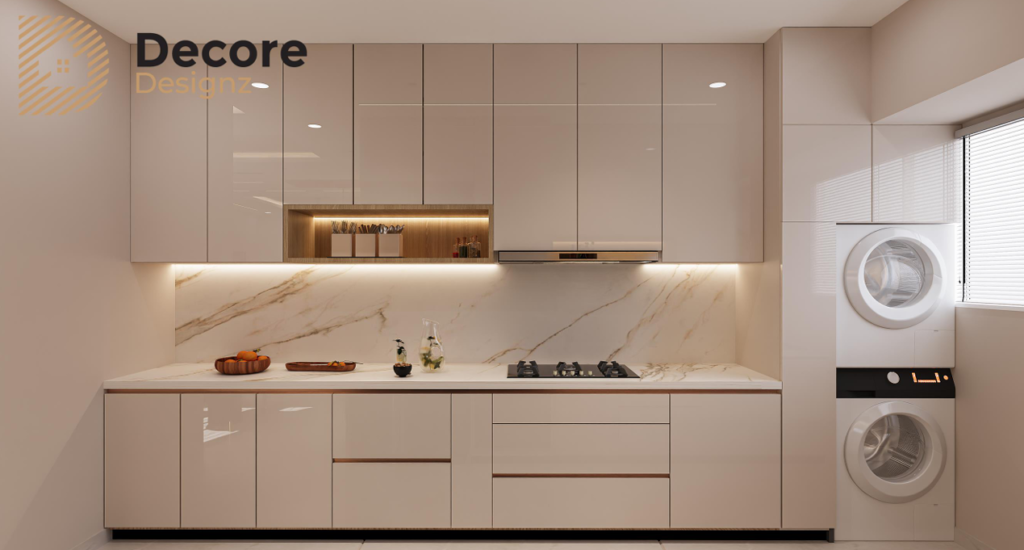
The right modular kitchen colour combination should balance the cabinet finish, countertop, backsplash, flooring and available light. Popular choices include white and wood, beige and brown, grey and white, green and cream, and navy blue with lighter neutrals. However, the best combination depends on the kitchen’s size, natural light, cleaning requirements and the look you want to maintain over time.
How do you choose the right modular kitchen colour combination?
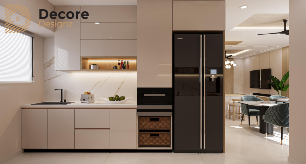
Start with the fixed elements of the kitchen rather than choosing cabinet colours in isolation.
Look at the countertop, floor tiles, backsplash, wall colour and amount of natural light. Then choose a main cabinet colour and decide whether you want a contrasting shade, a wood finish or a more subtle variation of the same colour.
A useful approach is to work with three visual elements:
- Main colour: the dominant cabinet or shutter finish.
- Supporting colour: a second cabinet shade, wood tone or neutral.
- Accent: a smaller detail such as hardware, a backsplash or an open shelf.
You do not need three different cabinet colours. In many kitchens, two finishes and a compatible countertop are enough.
What are the best modular kitchen colour combinations?
These combinations offer different looks, from bright and understated to bold and contemporary. Choose according to your kitchen’s light, existing finishes and maintenance preferences.
1. White and natural wood
White and natural wood create a balanced combination of brightness and warmth.
White cabinets help maintain a clean, open appearance, while wood tones add texture and prevent the room from feeling too stark.
Works well for: modern apartments, contemporary homes and kitchens with limited natural light.
What to watch: white surfaces can show spills and stains. The wood finish should also coordinate with other visible wood elements rather than introduce an unrelated tone.
2. Beige and warm brown
Beige and brown create a warmer, softer look than a high-contrast black-and-white kitchen.
Beige can work well as the main cabinet colour, while brown adds depth through lower cabinets, tall units or selected panels.
Works well for: warm contemporary interiors, homes with wood furniture and kitchens where a softer neutral palette is preferred.
What to watch: several similar beige and brown shades can look muddy if their undertones clash. Compare the finishes together under the kitchen’s actual lighting before finalising them.
3. Grey and white
Grey and white offer a restrained, contemporary appearance.
Light grey cabinets with white overhead units can keep the overall palette subtle. Darker grey can create a stronger contrast, especially when paired with a light countertop.
Works well for: minimalist kitchens, modern apartments and interiors with neutral flooring.
What to watch: dark grey can make a poorly lit kitchen feel heavier. If you prefer charcoal or graphite, balance it with lighter surfaces and sufficient task lighting.
4. Cream and olive green
Olive green and cream introduce colour without making the kitchen look overly bright.
Cream provides a lighter backdrop, while muted green gives the cabinets a distinctive character. Natural wood and understated hardware can complement the combination.
Works well for: earthy interiors, homes with warm wood finishes and homeowners who want colour without a highly saturated palette.
What to watch: green shades vary significantly. A muted olive, a grey-green and a bright leaf green create very different effects. Check a physical sample before committing.
5. Navy blue and white
Navy blue and white create a clear contrast.
Navy can define the lower cabinets or a selected tall unit, while white keeps the rest of the kitchen visually lighter.
Works well for: contemporary homes where the kitchen has adequate lighting and the homeowner wants a stronger colour statement.
What to watch: using navy across every cabinet can make the room feel visually dense. Keep the surrounding finishes controlled and check how the blue appears under both daylight and artificial lighting.
6. Black and wood
Black and wood combine a strong modern finish with natural warmth.
Black cabinets can create a defined, dramatic appearance, while wood tones soften the contrast.
Works well for: contemporary kitchens with good lighting and homeowners who prefer a darker, more defined aesthetic.
What to watch: dark finishes can show dust, fingerprints and certain water marks, depending on the surface. Consider the finish texture and cleaning routine before selecting them.
7. Sage green and off-white
Sage green is a softer alternative to deeper green cabinet finishes. Paired with off-white, it creates a gentle contrast without making the colour the only focus of the room.
Works well for: understated contemporary kitchens, natural material palettes and homes that use soft greens elsewhere.
What to watch: sage can appear grey, green or slightly blue depending on lighting. Review the sample beside the countertop and backsplash rather than relying only on a screen image.
8. Taupe and charcoal grey
Taupe and charcoal offer a more muted alternative to black and white.
Taupe provides warmth, while charcoal introduces contrast without the sharpness of pure black.
Works well for: contemporary homes with neutral flooring, stone surfaces and understated furniture finishes.
What to watch: this combination needs a deliberate balance of light and dark. If most of the cabinets, walls and floor are dark, the kitchen can feel enclosed.
Which colour combination is best for a small modular kitchen?
For a small kitchen, consider lighter or visually consistent finishes such as white and wood, cream and beige, or light grey and white.
These combinations can help the room feel more open, especially when natural light is limited. However, you do not have to avoid dark colours completely.
A darker lower cabinet or a selected accent can add depth without making every surface visually heavy.
The bigger priority is to coordinate the cabinet colours with the countertop, backsplash and lighting. A light cabinet finish will not compensate for poor lighting or an overcrowded layout.
For space-planning advice, see our guide to modular kitchen design in Hyderabad.
Should upper and lower kitchen cabinets be different colours?
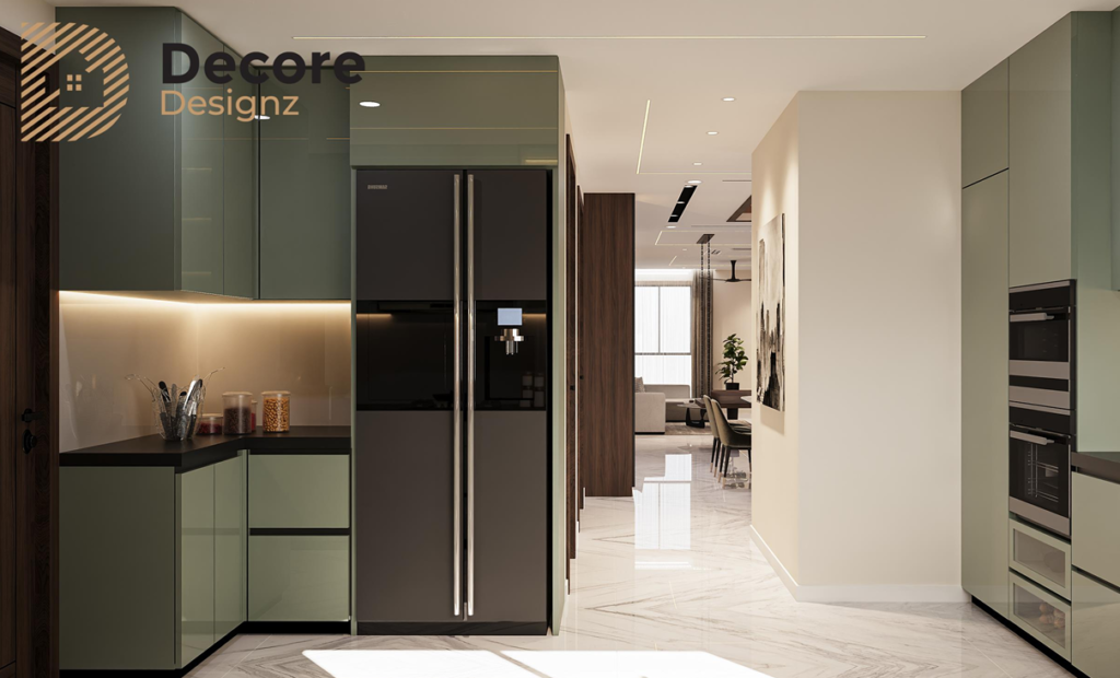
They can be, but the contrast should have a clear purpose.
A lighter upper cabinet and darker lower cabinet combination can make the upper portion of the kitchen feel less visually heavy. It can also help define the cabinet arrangement.
For example:
- White upper cabinets with wood-finish lower cabinets create warmth.
- Cream upper cabinets with olive lower cabinets introduce colour gently.
- White upper cabinets with navy lower cabinets create a stronger contrast.
- Light grey upper cabinets with charcoal lower cabinets create a restrained, modern look.
If you prefer a single-colour kitchen, you can still add variation through the countertop, backsplash, handles or a selected wood finish.
How should you match kitchen cabinet colours with the countertop?
The countertop should be selected as part of the colour scheme, not as an afterthought.
A few general pairings can help:
Cabinet combination | Countertop direction |
White and wood | Warm white, beige or a softly patterned neutral |
Beige and brown | Cream, sand or a complementary stone tone |
Grey and white | White or light grey with restrained patterning |
Olive and cream | Warm neutral or light stone appearance |
Navy and white | White or pale neutral for contrast |
Black and wood | Warm beige or a lighter surface to balance the dark cabinetry |
Taupe and charcoal | Light or mid-tone neutral to prevent the palette becoming too dark |
These are starting points, not fixed rules. The actual countertop pattern, undertone and finish can change how the combination looks.
For help comparing granite, quartz and other surfaces, consult the modular kitchen design guide alongside your material samples.
How do lighting and kitchen size affect colour choice?
A colour rarely looks identical in every kitchen.
Natural daylight, warm artificial lighting and cool task lighting can change how a cabinet finish appears. A beige that looks balanced in a showroom may appear yellow under warm lighting or grey in a darker room.
Before approving a finish:
- Check samples near the actual countertop and backsplash.
- View them in daylight and under the planned artificial lighting.
- Compare the finish with the floor and adjacent room colours.
- Consider how much of each colour will be visible.
- Check whether the chosen surface shows fingerprints, dust or stains easily.
This is particularly important in Hyderabad apartments where the kitchen’s window position and surrounding buildings may affect the available daylight.
What colour mistakes should you avoid?
A few common mistakes can weaken an otherwise good design.
Choosing colours from a screen alone. Digital images do not reliably reproduce the exact finish or undertone.
Mixing too many wood tones. Different wood finishes can clash when their colours and grain patterns are not coordinated.
Using dark colours everywhere in a poorly lit kitchen. Dark cabinetry can work, but it needs a considered balance with lighter surfaces and lighting.
Ignoring the countertop. A cabinet colour may look good on its own but clash with the stone pattern or undertone.
Following a trend without considering maintenance. Glossy, matte and textured finishes have different visual and cleaning characteristics.
Selecting finishes one at a time. Approve the main cabinet colours, countertop, backsplash and flooring as one coordinated palette.
How can Decore Designz Studio help with kitchen colour selection?
A kitchen colour scheme should work with the room’s layout, storage requirements, materials and lighting—not just with a reference photograph.
Decore Designz Studio plans modular kitchens as part of the wider interior, considering cabinet finishes alongside countertops, storage and the home’s overall palette.
Explore our modular kitchen interior design service in Hyderabad to understand how layout and finish choices fit into a complete kitchen plan.
Final tip
Choose your modular kitchen colour combination only after reviewing the cabinet samples, countertop, backsplash, floor and lighting together. A coordinated palette that suits your home and daily routine will usually age better than a combination selected solely because it is trending.
Frequently Asked Questions
Which colour is best for a modular kitchen?
There is no single best colour. White and wood, beige and brown, grey and white, and cream with muted green are useful starting points. Choose based on lighting, room size, existing finishes and maintenance needs.
Which two-colour combination is best for modular kitchen cabinets?
White and wood offer warmth and brightness. Grey and white create a contemporary look, while cream and olive green provide a softer colour contrast. The best pairing depends on the countertop and the amount of natural light.
Are dark colours suitable for modular kitchens?
Yes. Navy, charcoal and black can work well when balanced with lighter surfaces and appropriate lighting. Consider how the finish shows dust, fingerprints and water marks before choosing it.
Which modular kitchen colours make a small kitchen look bigger?
Light and visually consistent colours can help a compact kitchen feel more open. White, cream, beige and light grey are common choices, but good lighting and an uncluttered layout matter too.
Should kitchen cabinets match the countertop?
They should coordinate rather than necessarily match. Contrast can work well, provided the cabinet undertones, countertop pattern and backsplash create a balanced overall palette.
Is matte or glossy finish better for a modular kitchen?
Neither is always better. Glossy finishes reflect more light, while matte finishes create a softer appearance. Cleaning behaviour depends on the specific surface, colour and texture, so check samples and care instructions before deciding.